Back to all work
Brand identity
Good Crumb Bakery
A cheeky identity for a sourdough bakery that takes its bread very seriously and absolutely nothing else.
Client
Good Crumb
Year
2026
Discipline
Brand identity
Deliverables
Brand identity · Packaging · 2026
The brief: make bread fun again
Good Crumb bakes the kind of sourdough people queue for in the rain. The bakery had outgrown its photocopied flyers and wanted a look as warm and generous as its bread.
The problem
Priya’s first brief asked for loaves, wheat, an oven and a smiling baker, all in one logo. Half the bakeries in London already wear that badge, and none of them stand out from across the road.
The process
We kept it to one idea and tested it the way the bakery works:
A morning behind the counter. Every customer asked for the same thing: the crusty end.
One idea, not five. We dropped the wheat and the oven for a hand-stamped wordmark.
Stamp before print. We tried it on flour sacks, paper bags and till receipts first.
The result
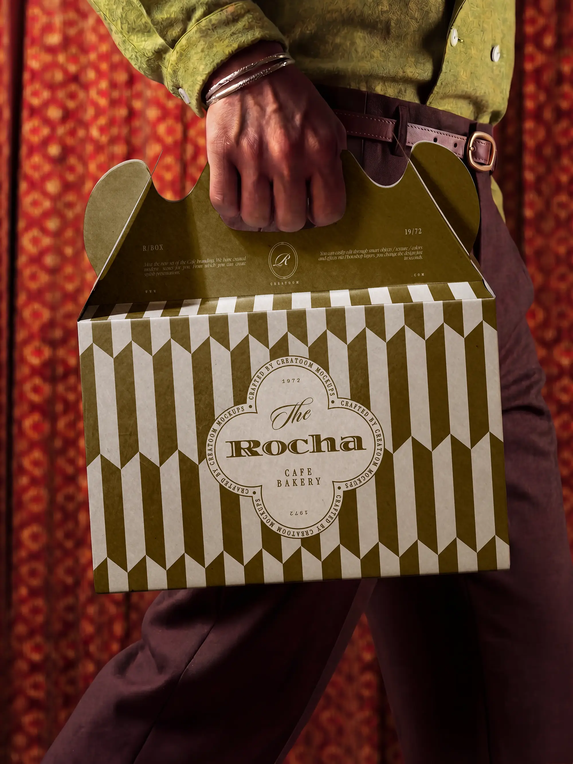
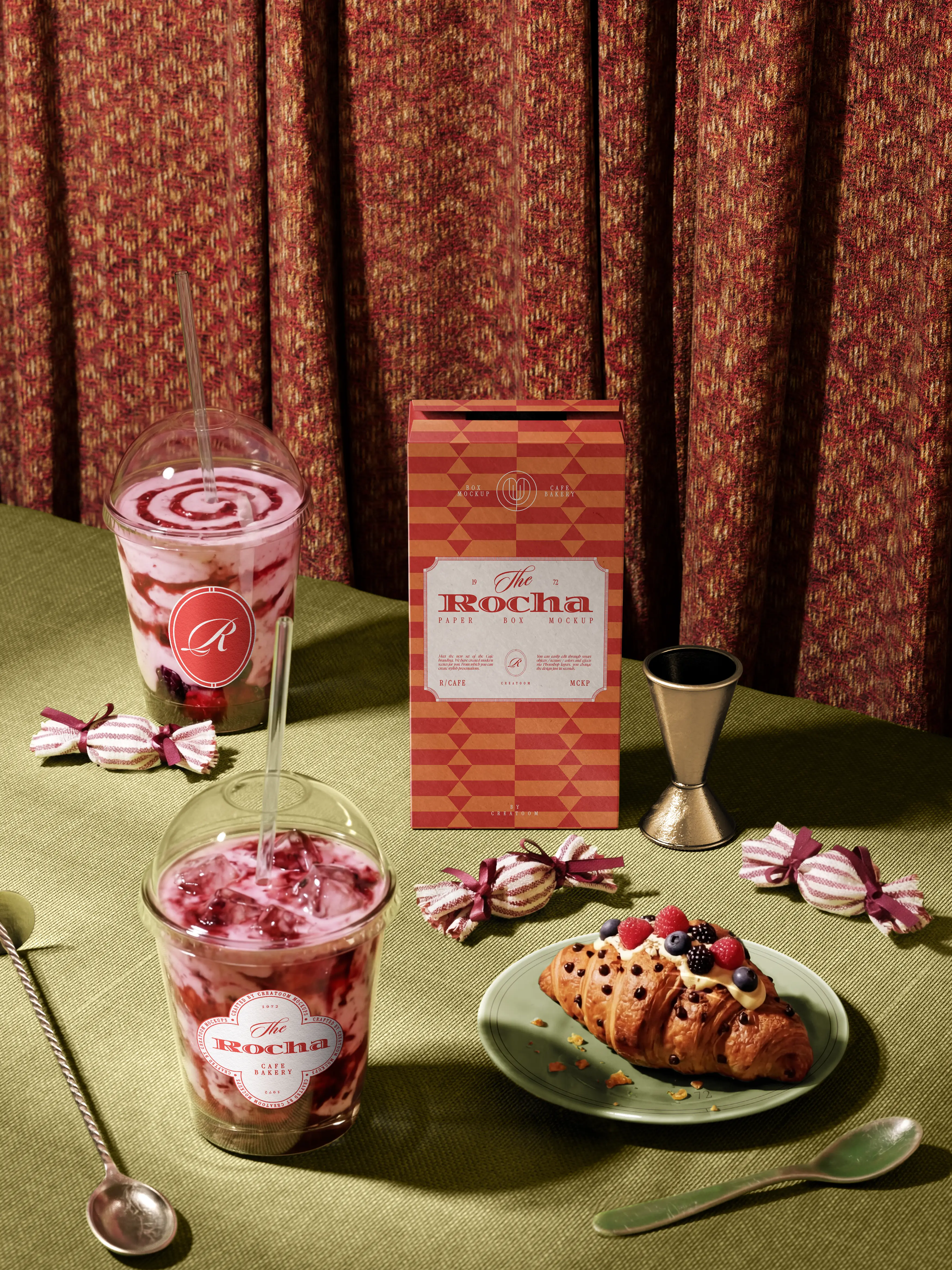
A chunky, slightly wonky wordmark, a palette borrowed from a golden crust and a cast of loaves with strong opinions, across bags, boxes, aprons and one very famous tote.
Six months in, the queue is longer, the tote has a fan club, and the loaf that sells out first finally has a name: The Big Crumb.